Branding & Creative Explorations
Exploring visual communication through digital and physical branding elements across different mediums and industries - showcasing creative range and technical proficiency in design tools.
Overview
Developing visual design skills across mediums - from print to digital interfaces. These explorations showcase creative range and technical proficiency beyond marketing content creation, or technical marketing solutions implementation.
These concepts are part of my portfolio, and they show my journey exploring the Adobe-suite, Graphic Design, Branding and Brand messaging through print designs, and web concepts. The designs displayed here were created between 2019 and 2023.
Print Design
These designs were initially created between 2019 and 2022. The goal of these, besides learning, was to experiment with expressing feelings, company and personal branding values through prints, such as Business Cards.
Creative Process
All of these materials had the same thought process:
- What feelings and emotions does this print need to transmit?
- What does it need to trigger? What is the wanted effect?
- What color palette and shapes express these the best?
- How can these be put together to create a cohesive representation of the brand/person?
After these questions were answered, the following steps were taken:
- Logo and shape design in Adobe Illustrator (for Fig 2 and 3)
- Logo insertion and Print design in Adobe InDesign
- Insertion of the print in Adobe Dimensions and mock photo shooting
Results
While the rest of the world modernized, business cards are still used in Japan as a mean to communicate respect, trust, power and relationship status of both the individual and of the company. As such, they play an essential role in relationship building and brand messaging, especially in B2B contexts. The following design was inspired by the simplicity of some Japanese executive’s cards, as it conveys minimalism, simplicity, professionalism, accuracy and respectful directness. It assumes that reputation precedes the card’s owner - as there is no mention of title or company. In such circumstances, the individual is the company’s branding, insinuating high status, respect and power.

The following card stands in complete opposition with the previous one. Inspired by Golf states’ millionaires working in real estate and private investment industry, this Gold and Black business card reflects professionalism, luxury, youth and good fortune. The minimalist details of the logo and the simple font show modernity. Overall, it shows elegance, exclusivity, with a certain degree of pompousness.

This last design was actually used as a marketing material for a highschool business contest in 2019-2020.
In another extreme, a card design that aims to emulate the branding of a tech-driven company, working in a complex, but energized industry. The logo and visual elements emphasize precision through their sudden corners and angles. The colors imply growth and potential. Based on this, it can be assumed that the card owner works in an emerging tech start-up.

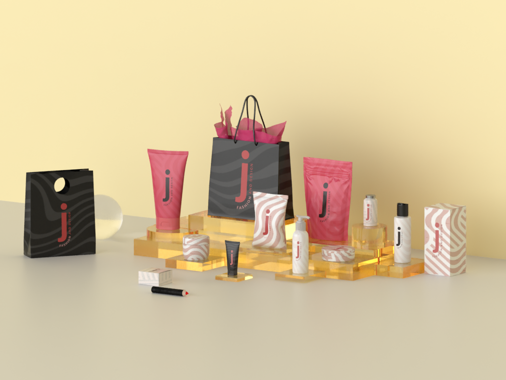
Visual Identity
I experimented with Adobe Illustrator and Dimensions to create a visual identify for a minimalistic, luxury-driven fashion and makeup brand. The goal was simple: to provide an alternative look and feel to products normally presented with powerful, eye-catching colors, and clouted packaging.
Creative Process
The thought process behind these consisted as such:
- Messaging and triggers What emotions needed to be generated in the mind of a consumer?
- Color scheme Which color scheme would emulate and would help to transmit this messaging about the brand?
- Logo creation What logo design would be memorable for the consumer?
- Pattern design Which geometrical shapes generate the wanted effect?
Based on these questions, I created a mock brand that needed to transmit simplicity, femininity, warmth and calmness, premium and professionality, and cleanness. As such, the color scheme that would represent the brand was:
- Charcoal Black (#25231F) - reserved for the more premium products and for the charcoal-based cleansers.
- Deep Rose (#BF4572) - symbolizes the feminine energy and its strength
- Beauty Bush (#EEC1BE) - softness and simplicity
- Pastel Grey (#D5CFC3) - used for background pattern variation
Meanwhile, as for the pattern, fluid geometrical shapes where chosen, transmitting a sense of flow, calmness, but also a certain level non-conformity.
A quick commentary should be made in regards to the color scheme. The black can be considered a rather dividing choice for packaging. Besides the reasons listed above, integrating black elements with these colors make the brand stand out, as most skin care products have white packaging. Another way to consider this color scheme can be based on the current trends in branding. Big companies tend to use packaging that captures the consumer’s eyes with large texts, high contrasts and strong colors. In contrast, the lesser-known, boutique brands, which are often considered to have premium products with a higher quality, tend to opt for minimalistic packaging and pastel-based color schemes.
Results
Below can be seen the main patterns and color variations.

I used the color schemes and the created patterns to create a photoshoot in Adobe Dimensions in order to better display how the products would look like.
Digital Interface Concepts
I experimented with various layouts for the Blog section and for the Offers page for a digital marketing agency I built together with a few friends, Growly, in 2022-2023. The experiment consisted in finding solutions that would use the branding style (a very difficult branding guideline to use for UX) for better website layout. It improved my problem-solving skills in regards to design-aspects under unfavorable constraints.

While the Offers pages lacked in appropriate colors (and overall I am not pleased with it), the Blog section allowed more experimentation for responsiveness, carousels, transitions and page layouts. These are some of the concepts I came up with, given the constraints.


Nescafe Protein Shake Print & Digital
The following resources were created to aid a colleague at during my studies at Avans University of Applied Sciences in Breda, the Netherlands, between 2020 and 2022. She requested similar resources to the ones I made for the CanCan project, but applied in the context of Nescafe’s Protein Shake.
Creative Process
The following steps were taken:
- Research the brand and the products
- Identify the products and create PNGs for them
- Use Adobe Dimensions and InDesign to create posters
- Create a quick home page for their website in Adobe XD
- Create mock-ups using Adobe Photoshop
Results
Below it can be found a collection of the Hero sections for the product’s website. While rudimentary, it served as a good foundation for further brand exploration and brand messaging.


Finally, a mock-up of how some street posters might look, together with the designed messaging.

Reflections
Through many projects and experimentations such as these, I gained a solid foundation is designing and illustrating various concepts and materials using creative software, such as Adobe Suite, and Figma.
I am a firm believer in continuous, life-long learning, with a can-do attitude and willingness to deal with seemingly impossible challenges. Through this mentality, I developed a passion for both theoretical learning and studying-by-doing, which have formed my current skillset.
Made you curious? Then feel free do reach out to me via these channels: 📧 Email me for a discussion 📱 Connect with me on LinkedIn
Or you can read more about me, how I think as a team member and marketer, and why I developed this wide-ranging skillset on the About page.
Keywords: Adobe Creative Suite, Branding, UX, Mockups